Methods
12 min read
How to design with scrappy data
A how-to on analytics data for SaaS marketing websites
from some guy who barely passed highschool algebra
How to design with scrappy data
Mike Stilling
Summary
The blog post underscores the importance of data for marketing websites, even for non-data scientists. It covers understanding the marketing funnel, user acquisition channels, and measuring impact through analytics. Tools like Google Analytics or Plausible Analytics are recommended to gather data on button clicks and scroll depth, aiding in design decisions and user conversion rates. The focus is on practical methods for data-driven design improvements.

Kicking off this article with a little bit of honesty - I’m not a data scientist. In fact, my math skills might leave a lot to be desired. I barely made it through high school geometry, so my methods for analyzing data might not be textbook.
Just like my unconventional background, I’ve noticed that many of the companies I’ve worked for haven’t exactly been champions of data collection or analysis. Finding and surfacing any relevant data tends to be a task in itself. Oddly enough, in a world that’s all about “data-driven decision making”, data often still seems like a mystery.
But here’s the thing, most people tend to rely on data someone else has collected, interpreted, or mentioned, without really knowing how to capture it for their own specific needs. Well, we’re about to change that, starting now—at least for folks working on marketing websites.
Why knowing how to get/read data is important
I’ve been there too. My work used to be guided by a quick Google search, leading me to websites like Nielsen Norman. To really get a grip on how my own work was performing, I had to rely on an engineer or a marketer to hunt down data and share their insights. More often than not, the data I needed just wasn’t available, or it was too high-level to directly tie back to my design decisions.
After working in a few roles where I was responsible for both the design and development of companies’ marketing websites, I started realizing, “Hey, this data shit isn’t that hard…” especially with the right tools. The process of implementing and collecting analytical data also taught me a few things.
Understand the funnel
As a designer or developer, our work on marketing touch points is part of a bigger picture: the marketing and sales funnel. Understanding where our work fits in this process and how people reach that point can give us lots of useful information.
For example, imagine we’re asked to redesign a product page because it’s outdated and no longer aligns with the product. Before we start, it would be useful to know how and why people come to this page. It’s likely that most visitors arrive in a similar way, so our design should primarily cater to these users.
The marketing and sales process can be divided into stages like the top (ToFu), middle (MoFu), and bottom (BoFu). As someone moves through these stages, they become more aware, informed, and motivated to achieve a company’s goal, like making a purchase.
Each stage relies on different channels to communicate with users categorized within these buckets. If you’re not familiar with the term, channels are the ways users get to your website. Before the internet, these were things like print, billboards, radio, and TV. Now, they’re mostly digital:
-
Organic search
Traffic from a search engine (without seeing a paid search ad).
-
Paid Search
Traffic from a paid ad on a search engine.
-
Organic Social
Traffic from a social media post or page (that wasn't paid for).
-
Paid Social
Traffic from a paid ad on a social media platform.
-
Referral
Traffic to your site from other websites.
-
Direct
Traffic to your site that directly typed in the URL.
Note: If this percentage is extremely high, your data collection or filtering is probably wonky.
-
Email
Traffic to your site from email campaigns. Super boring. 😂
Understand user acquisition
Most analytics tools, with no customization, capture channel data. This data is readily available. If not, it can be accessed by simply creating an account with an analytics tool and applying their script to your site. Knowing our way around these tools allows us to determine user motives. For instance, if users land on a product page through organic search, analyzing specific search terms can help reveal user intent.
Search is usually linked to the ToFu. In a MoFu/BoFu example, let’s assume most traffic to a product page comes from LinkedIn (paid social), retargeting those who have visited our website. Most ads contain links with UTMs which allow us to identify which ads drive most traffic, along with their copy, and imagery.
Intent is typically motivated by a question, interest, or problem. By addressing this and showing how our product/service solves it, we increase the chances of users accomplishing our intended goal (conversion). This isn’t complex, but how often is it accounted for in your design process?
Understand impact
We’ve assumed that whatever page we’re looking into the source data on is worth our time. But what if it’s not? How can we know? Data on page views and new users per page is all easily available too, just like the source data.
Let’s say we’re working on a product page. But then we notice that this page only gets 1/10th of the traffic of another equally outdated page. This is where we need to decide what’s more important—setting priorities.
The page with more visitors can have a bigger impact on our business. More visitors mean more chances to convert them into customers—more conversions, more profit.
We should also think about why the less-visited page isn’t as popular. Let’s check the source data again. If the low traffic isn’t intentional, maybe we should still prioritize this page. But first, we need to focus on attracting more visitors, not just improving the design.
Own your role
Clearly, even basic knowledge of analytics can be a game changer. Through it, we evolve from task executors to data-driven problem solvers with technical skills to boot. We can now incite, prioritize, and inform our own work with clear purpose and logic.
We’ve covered the basics and most of the steps before a user interacts with our work. Awesome! But, how do we use data to understand how users interact with the work itself? How can we tell if our effort has improved conversion rates? Which part of our work caused this?
We’re going to explore these questions below. Get ready, it’s going to get a bit more technical.
Get meaningful data from your work
Standard metrics from common analytics tools often fall short. Meanwhile, most teams rely on this data because they’re unfamiliar with customized ways to gather deeper insights—influencing our work initiatives in wonky ways.
Insufficient data often leads to an unnecessary accumulation of analytics tools, too. Instead of getting the most out of a single, streamlined tool, teams pile on new ones that capture different data.
Each added tool slows down site load times, worsening user experience. These are usually not lightweight scripts. A typical SaaS marketing site might load scripts from Google Analytics, various social tracking pixels, HotJar, HubSpot, G2, and Amplitude. This not only slows loading but also complicates data analysis across multiple tools — a poor experience even for backend users.
So, let’s change that.
Choosing an analytics tool
Everything I’ll be covering below is easily achievable with custom events in Google Analytics. However, it’s worth noting that there are better tools out there. Although Google Analytics is free, it can be confusing and overwhelming.
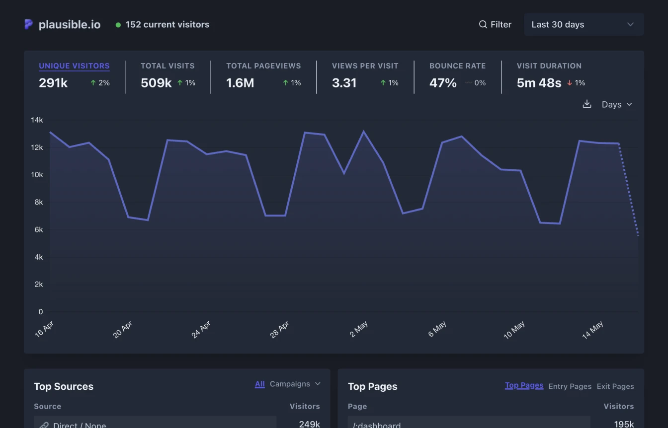
I’ve been using Plausible Analytics lately. Its dashboard is user-friendly and easy to navigate. Adding custom events is usually as easy as adding a CSS class. It does cost a bit, but it’s not pricey. I think it’s worth it.
With that said, there are loads of analytics tools out there. It is worthwhile to peak around and find which one you prefer. When evaluating tools, a few things that I like to keep in mind are:
- Ease of use
Whether it’s understanding the data or how to collect it—choosing a tool that makes this stuff as simple as possible is a no-brainer. - Script size
Analytics tool vary in “file size” — try keeping these third-party scripts as small as possible to prevent delaying page load speeds. - Privacy first
I prefer using tools that prevent the need for a consent banner. Properly handling cookies and personal data is a pain in the ass.
Determining what data you need
Even before choosing a tool, it may be worth thinking through the data that you need. This way, you can ensure the tool that you’re looking at supports your requirements. But, how do we decide what we need to track?
Since this article is geared toward marketing sites, as a reference I’ll cover a couple of the key things I want when designing and building these and why. If you’re not a developer, not to worry—knowing this stuff will help you communicate with them and understand the possibilities.
Specific button clicks
Understanding what people are clicking on within your site is important, especially when it comes to conversion. While most tools will tell you which pages users navigated between, they won’t specify how they navigated between them.
You can imagine the scenario where you just redesigned a page, wouldn’t be it be helpful to know which section is pushing users to convert? Or, what if most users are just using the CTA within the header? In any case, this helps us understand what content is effectively helping us drive users to take the next step.
There’s also a scenario where a marketing site and product are decoupled—leaving a gap in the built-in page navigation data. Some tools will provide exit data that covers this, but adding these custom events to important clicks ensures it, while giving us deeper insight.
In this instance, this data will also help inform where users are falling off. Let’s pretend, over the course of a month, our site sent 10,000 users to the product’s sign up page but, during that same period, only saw 500 sign ups. Here we discover the current hangup being the sign up page itself.
Scroll depth
Marketing websites are largely influenced by content. It’s important to know what parts of the content people actually see - just visiting a page doesn’t necessarily mean they see everything on it.
Scroll depth tracking helps us understand what parts of the page users see. This method records custom events as a user scrolls through a webpage. I use two different formats of this on this site. You can check it out by opening the developer tools (⌘⌥i) and looking at the console.
If your site uses semantic HTML and the sections are not too large, you can record custom events when these sections are viewed. If your HTML is not well organized or you want to understand pages with a lot of content (like a blog post), it might be better to record custom events at specific points as a user scrolls down the page. For example, you could record when a user has scrolled 10%, 25%, 50%, 75%, and 100% of the page.
You can do this with Javascript’s intersection observer. I won’t go into the code details here, but you can see how I use Plausible and intersection observer for this here.
This data will help us structure our pages by showing us which parts to put the most effort into. For instance, if most users are only looking at the first three sections of our pages, we can stop pouring so much time into updates on less seen areas. From here, we could even use our tool’s API and generate basic heat maps.
Going beyond
While these two properties likely won’t cover everything you want from analytics, the intention is to show how to go about considering what data you may need—then how it can be captured. Every site and every company is different, so the data that is needed will vary.
Implementing custom analytics
I’m not going to deep dive into how to do this with code because it is extremely simple for most developers and it varies from tool to tool. If you’re a novice developer like myself, to get started visit your tool’s docs and look for “custom events”. Please reach out if you have any questions!
The important takeaway here is the fundamentals. Even if you don’t know the front-end from the back, after reading this article, you should know how to constructively communicate with team members who can help with implementing custom analytics.
If there’s push back due to time constraints, it’s non-sense. Most developers could add a custom event in hours, if not only minutes.
Start designing with data
Now, you’ll notice I didn’t touch on actual data analysis. That was intentional—I don’t know the first thing about sample sizes and evaluating whether or not, based on that, the data I’m looking at is accurate or not. To some extent, I don’t believe that this matters. 🌶️
This could be blissful ignorance. But whether your site has 100 or 100,000 users, utilizing any amount of data should improve your designs and lead to better outcomes. We now know what this data is, how to comprehend it, and how we can start to utilize it—so let’s go!
Dive into analytics, understand how and why people are getting to your site, know what works and what doesn’t, fix it, experiment, iterate, keep on designing, and you’ll quickly become the acquisition rock star at your company.
Help
start
the conversation
Agree or disagree? Let us know on LinkedIn. This is really just a push for organic social lol.

Get Blame's Newsletter
How to drive revenue with design and prove it—directly to your inbox.